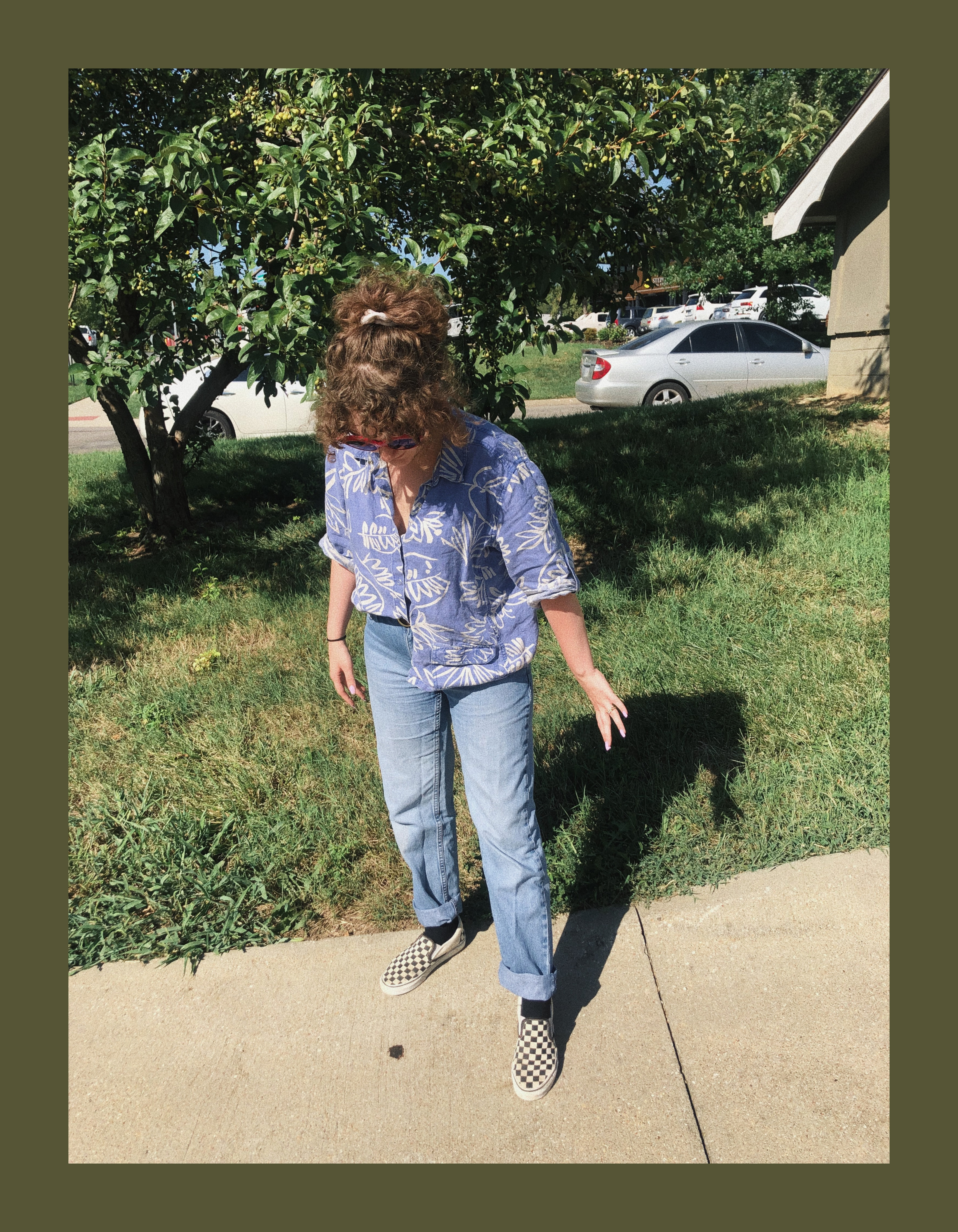
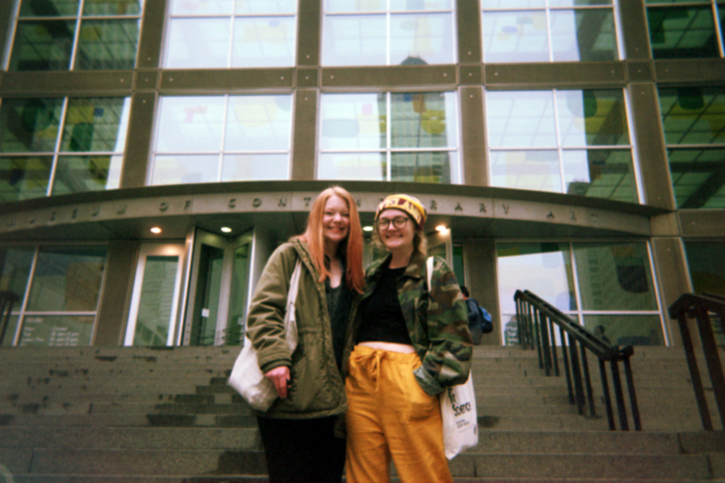
<!DOCTYPE html>
<html lang="en">
<head>
  <meta charset="UTF-8">
  <title>Savannah’s World</title>
  <meta name="viewport" content="width=device-width, initial-scale=1.0">

  <!-- Google Fonts -->
  <link href="https://fonts.googleapis.com/css2?family=Poppins:wght@400;700&family=Dancing+Script&display=swap" rel="stylesheet">

  <style>
    /* Body & Background */
    body {
      font-family: 'Poppins', sans-serif;
      background-color: #ead1dc; /* soft pastel base */
      background-image: url("scrapbook-bg.jpg"); /* 90's scrapbook texture */
      background-repeat: repeat;
      background-size: contain; /* or 'contain' if you want to fit it inside */
      background-blend-mode: multiply; /* or overlay */
      color: #333;
      line-height: 1.6;
      padding: 20px;
      text-align: center;
      position: relative;
      overflow-x: hidden;
    }

    /* Floating doodles for whimsy */
    .floating {
      position: absolute;
      width: 20px;
      opacity: 0.6;
      animation: float 6s infinite ease-in-out;
    }
    .floating.heart { font-size: 20px; color: pink; }
    .floating.star { font-size: 18px; color: gold; }

    @keyframes float {
      0% { transform: translateY(0) rotate(0deg); }
      50% { transform: translateY(-15px) rotate(15deg); }
      100% { transform: translateY(0) rotate(0deg); }
    }

    /* Navbar container */
    .navbar {
      display: flex;
      justify-content: center;
      gap: 20px;
      margin-bottom: 30px;
      flex-wrap: wrap;
      background-color: #6a1b9a; /* Purple background */
      padding: 12px 20px;
      border-radius: 15px;
      box-shadow: 0 4px 6px rgba(0,0,0,0.1);
    }

    /* Navbar links */
    .navbar a {
      text-decoration: none;
      font-weight: 600;
      font-family: 'Dancing Script', cursive;
      padding: 12px 20px;   
      font-size: 1.4rem;    /* Bigger text */
      color: #fff;          
      border-radius: 10px;
      transition: all 0.3s ease;
      position: relative;
    }

    /* Hover & Active Effects */
    .navbar a:hover,
    .navbar a.active {
      background-color: #ffe4e1; /* Light pink on hover */
      color: #6a1b9a; 
      transform: scale(1.1);
      box-shadow: 0 2px 4px rgba(0,0,0,0.2);
    }

    /* Boxes */
    .box {
      background-color: #fff;
      padding: 20px;
      margin: 0 auto 30px auto;
      border-radius: 10px;
      border: 3px dotted purple;
      max-width: 600px;
      box-shadow: 0 4px 6px rgba(0,0,0,0.15);
      transition: transform 0.3s, box-shadow 0.3s, filter 0.3s;
      overflow: hidden;
      position: relative;
    }

    .box:hover {
      transform: translateY(-5px);
      box-shadow: 0 8px 12px rgba(0,0,0,0.25);
      filter: brightness(1.05);
    }

    /* Polaroid Photos Row */
    .polaroid-row {
      display: flex;
      justify-content: center;
      gap: 20px;
      margin-bottom: 40px;
      flex-wrap: wrap;
    }

    .polaroid {
      background-color: #fff;
      border-radius: 10px;
      border: 3px dotted purple;
      box-shadow: 0 4px 6px rgba(0,0,0,0.15);
      overflow: hidden;
      width: 220px;
      height: 220px;
      transition: transform 0.3s, box-shadow 0.3s, filter 0.3s;
      position: relative;
    }

    .polaroid img {
      width: 100%;
      height: 100%;
      object-fit: cover;
      display: block;
      transition: transform 0.4s ease;
    }

    .polaroid:hover img {
      transform: scale(1.08);
    }

    /* Caption under polaroids */
    .polaroid p {
      font-family: 'Dancing Script', cursive;
      font-size: 0.9rem;
      margin-top: 5px;
      text-align: center;
      color: #6a1b9a;
    }

    /* Responsive Polaroids */
    @media only screen and (max-width: 700px) {
      .polaroid-row {
        flex-direction: column;
        align-items: center;
      }

      .polaroid {
        width: 90%;
        height: auto;
      }
    }

  </style>
</head>
<body>

  <!-- Floating Doodles -->
  <div class="floating heart" style="left:20%; top:50%;">❤</div>
  <div class="floating star" style="left:60%; top:70%;">★</div>
  <div class="floating heart" style="left:80%; top:30%;">❤</div>

  <!-- Navigation -->
  <nav class="navbar">
    <a href="index.html" class="active">Home</a>
    <a href="about.html">About</a>
    <a href="gallery.html">Gallery</a>
    <a href="contact.html">Contact</a>
  </nav>

  <!-- Welcome Box -->
  <div class="box welcome">
    <h1>Welcome to Savannah’s World!</h1>
    <p>My cozy corner of the internet...</p>
  </div>

  <!-- Heavy Rotation Box -->
  <div class="box heavy-rotation">
    <h1>🎵 Heavy Rotation</h1>
    <p>Here’s what I’m currently listening to, obsessing over, and loving — my current favorites on repeat!</p>
    <ul>
      <li>Champagne Supernova - Oasis</li>
      <li>The Background - Third Eye Blind</li>
      <li>Called You Twice - FIDLAR (feat K. Flay)</li>
      <li>Over and Over (Feat. Tim McGraw) - Nelly</li>
      <li>Deep Inside of You - Third Eye Blind</li>
      <li>Take Me As You Please - The Story So Far</li>
      <li>After the Party - The Menzingers</li>
    </ul>
  </div>

  <!-- Polaroid Photos Side by Side -->
  <div class="polaroid-row">
    <div class="polaroid">
      <img src="photo1.jpg" alt="Me 2019">
      <p>Me 2019</p>
    </div>
    <div class="polaroid">
      <img src="photo2.jpg" alt="Chicago with Skippy 2019">
      <p>Chicago 2019</p>
    </div>
    <div class="polaroid">
      <img src="a failed cartwheel.jpeg" alt="A failed cartwheel 2019">
      <p>
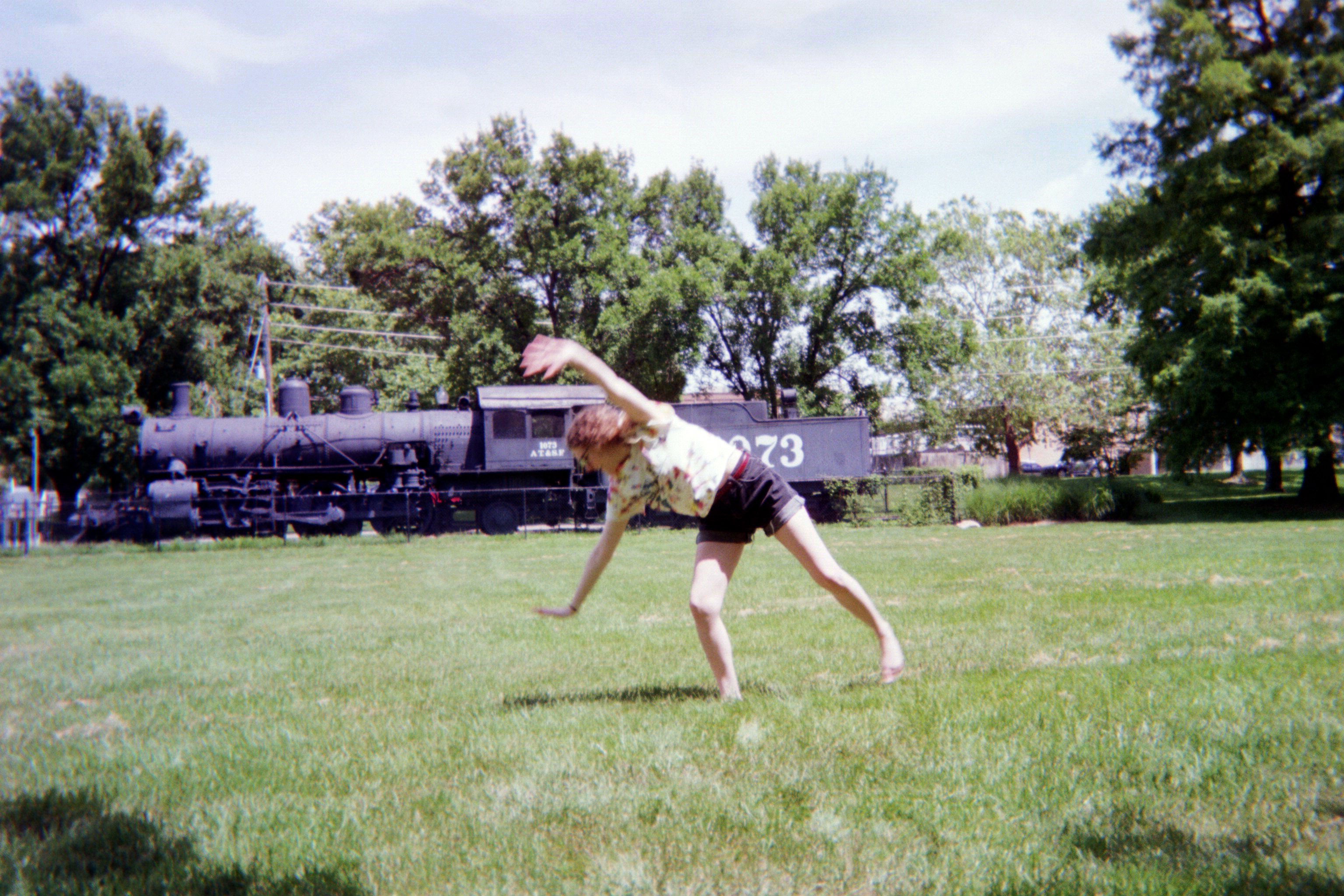
Failed cartwheel 2019</p>
    </div>
  </div>
  .star-list {
  list-style: none;
  padding-left: 1.5em;
  margin: 0;
}

.star-list li {
  position: relative;
  margin-bottom: 0.5em;
}

.star-list li::before {
  content: "⭐";
  position: absolute;
  left: 0;
  top: 0;
  margin-right: 0.5em;
}

.star-list li:hover {
  color: #ff1493;
}
.album-row {
  display: flex;
  align-items: flex-start;
  gap: 15px;
  margin-bottom: 20px;
}
.album-cover {
  width: 80px;
  height: 80px;
  object-fit: cover;
  border-radius: 5px;
  border: 2px dotted purple;
  box-shadow: 0 2px 4px rgba(0,0,0,0.15);
  cursor: pointer;
  transition: transform 0.2s;
}
.album-cover:hover {
  transform: scale(1.05);
}
.album-text {
  flex: 1;
}

/* Lightbox */
#album-lightbox {
  display: none;
  position: fixed;
  top:0; left:0;
  width:100%; height:100%;
  background-color: rgba(0,0,0,0.8);
  justify-content: center;
  align-items: center;
  z-index: 1000;
  overflow: hidden;
  display: flex;
}

/* Lightbox Image */
#album-lightbox-img {
  max-width: 90%;
  max-height: 90%;
  border-radius: 10px;
  box-shadow:0 4px 10px rgba(0,0,0,0.3);
}

/* Floating Hearts/Stars inside lightbox */
#album-lightbox .floating {
  position: absolute;
  font-size: 18px;
  opacity: 0.5;
  animation: float 6s infinite ease-in-out;
}
#album-lightbox .heart { color: pink; }
#album-lightbox .star { color: gold; }
@keyframes float {
  0% { transform: translateY(0) rotate(0deg); }
  50% { transform: translateY(-15px) rotate(15deg); }
  100% { transform: translateY(0) rotate(0deg); }
}

@media only screen and (max-width:700px){
  .album-row { flex-direction: column; align-items: center; }
  .album-cover { width: 90px; height: 90px; }
}
// Album cover lightbox
const albumCovers = document.querySelectorAll('.album-cover');
const albumLightbox = document.getElementById('album-lightbox');
const albumLightboxImg = document.getElementById('album-lightbox-img');

albumCovers.forEach(cover => {
  cover.addEventListener('click', () => {
    albumLightboxImg.src = cover.dataset.full; // full-size image
    albumLightbox.style.display = 'flex';
  });
});

albumLightbox.addEventListener('click', (e) => {
  if(e.target === albumLightbox || e.target === albumLightboxImg){
    albumLightbox.style.display = 'none';
  }
});
</body>
</html>
